A Route Planning Case Study
From sound board to radio: Simplifying complexity

The company
Background story
The company I work for full-time builds software for GPS tracking, efficient routing and planning, and analytics. They offer their software as a service (SaaS) with a full suite of modular web-apps to customers in the field-service and delivery industries who have fleets and service orders to manage.
Founded in 1996, the company developed an ahead-of-its-time OP (optimization platform) to crunch the numbers and help businesses intelligently schedule appointments, make routes, and track their daily performance to see where they can cut costs and improve their operations.
What I inherited
Existing or past solutions
There was already a monolithic routing UI contained in an application dubbed ESO. Setting up users was a several-weeks long process where the company would even send employees across states or across the country to their customers to help them set up their fleets and enter in all of their data.
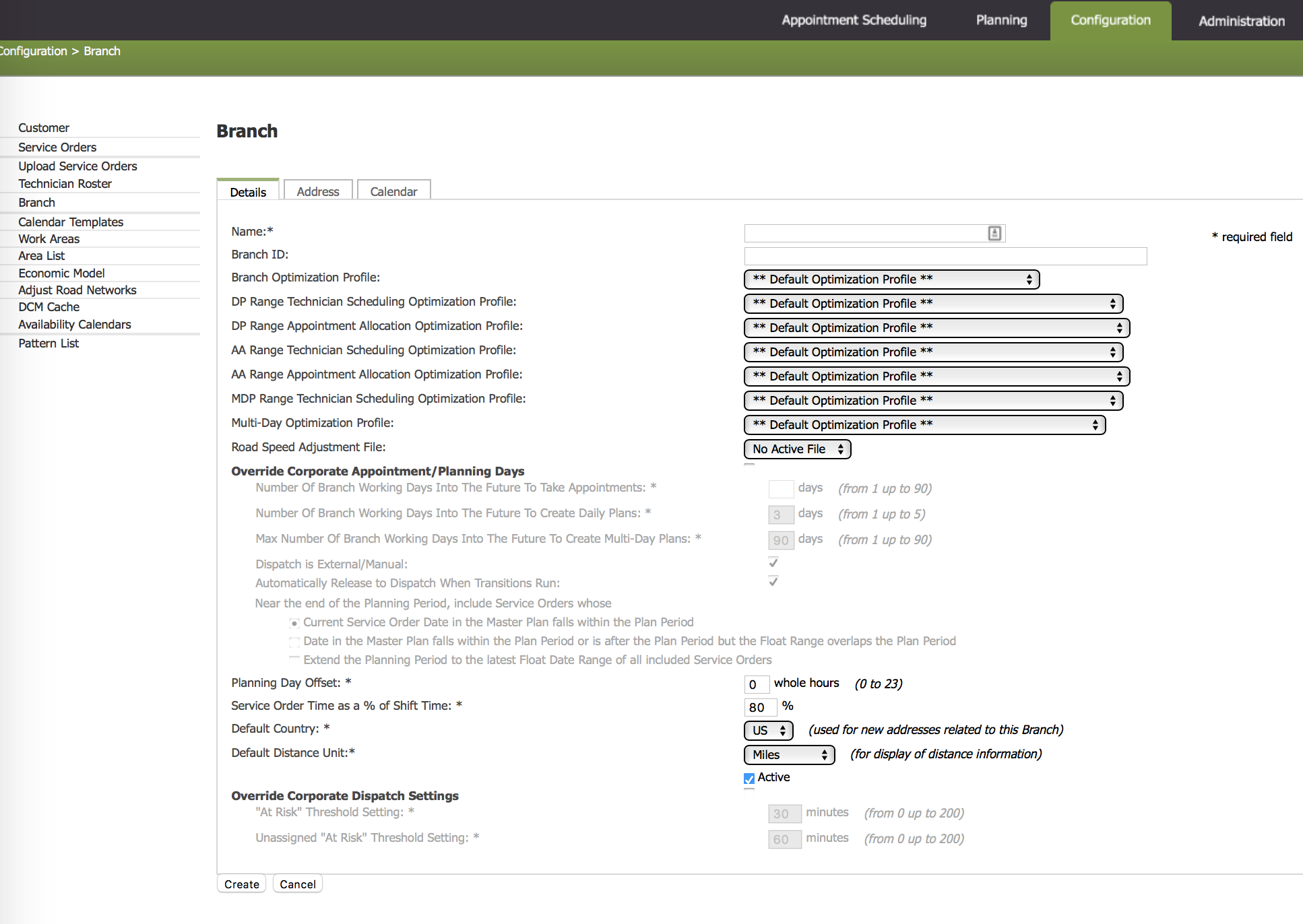
The UI was no less complicated. With pages among pages of huge lists with many checklists and difficult to understand fine-tuning adjustments to be made (many of the company's employees didn't even know what some of the functions were), the app was a pain to use for all involved.
Once set up, however, some of the company's largest customers saved thousands to millions a year and believed it all to be worth-it.

The problem
Make it better!
In more recent times, the company decided to take a new approach to their business strategy– they already had a handful of large enterprise companies that gave them a steady flow of income. The problem was, they wanted to increase their revenue and bringing on more of these monolithic companies took months to up to a year and were difficult to come by and set up. They wanted to branch out to small/medium businesses and thus needed a smaller, more lightweight and less complex solution.
They wanted a new simple routing web-app.
The team
Dynamics and integrating across departments
I worked primarily with the project manager (PM) who first corresponded with the executive team to get an overhead grasp of what the business goals were. Both the executives and PM gathered what the demands were of existing and customers-to-be and listened to what their pain points had been over the years of working with the existing planning and routing platform that the company originally built. After the first wireframes are put together, the executives, PM, and I all meet on multiple occasions to discuss the wireframes and come up with further solutions.
Once the needs and designs of the new routing app were settled on, it was on to the development team to implement the new project. The dev team at my company is agile and works on 4-5 week milestones of a set of deliverable functionality, features, or defect/support fixes. They have 2 week iterations within these for demos with the entire company. Daily stand-up discussions in the morning are followed by a tech huddle for the dev team to discuss the day's tasks and an afternoon checkpoint to discuss and road blocks or challenges during the day.
Research
Who am I designing for?
Due to the small size of the company, getting to work with people who already had inside knowledge and experience working with the customers we were developing the solution for was an easy convenience. A lot of the systematic and functional requirements came from the initial meeting among executives, feedback from our sales team in the field, and the PM.
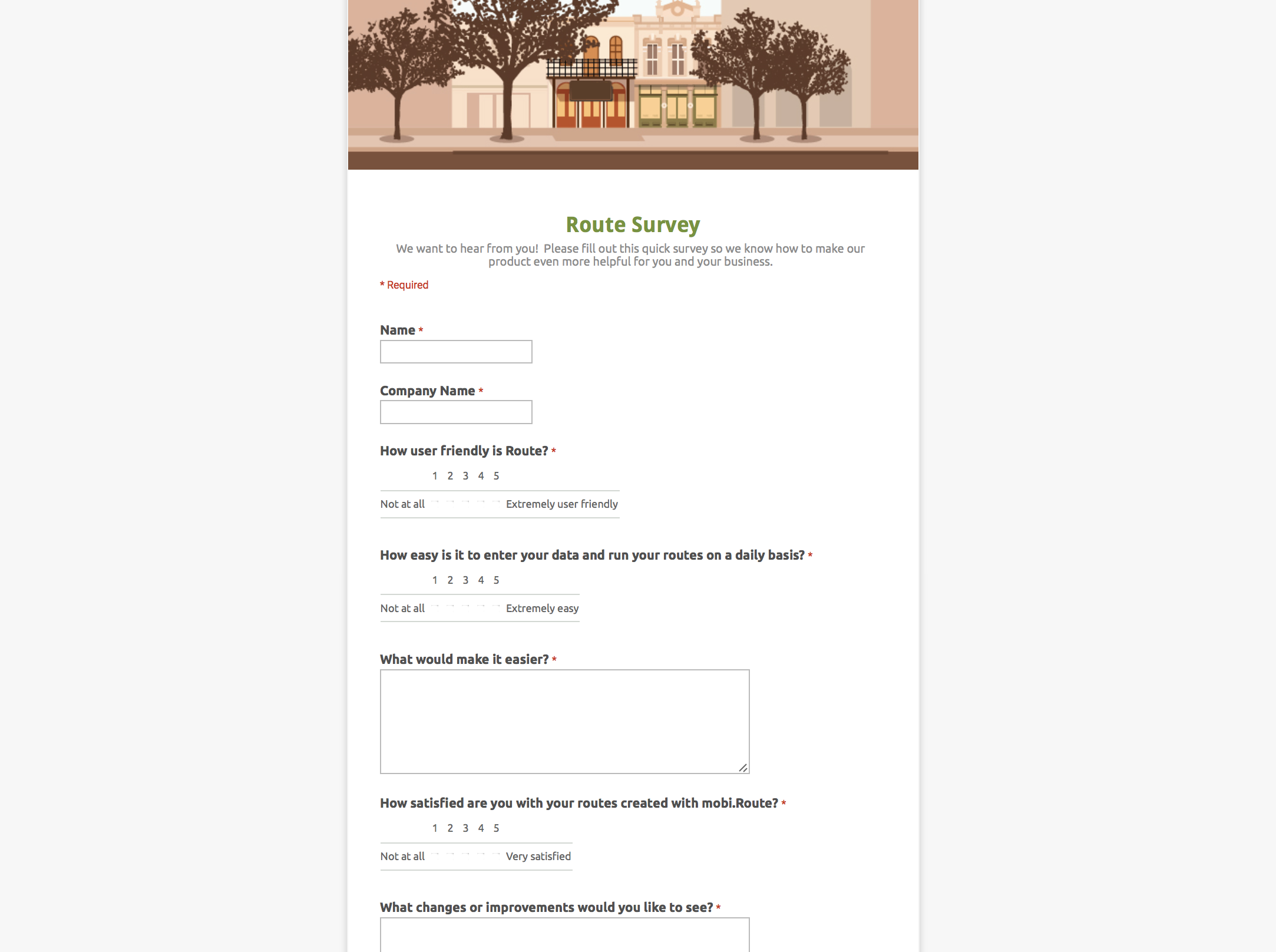
Additional information was gathered from:
- Competitor research: Our industry advantage was that our competitors do one thing or the other (GPS tracking, but not routing, etc.) , while we offer every solution as a modular create-your-own package unique to each business. We had to figure out ways in which we could do things better, which first involved making sure we were at least offering the basics of what everyone else was offering.
- Industry standards and existing methodologies: Similar to competitive research, ensuring that our routing app workflow was not so drastically different from what users were already doing. We didn't want it to be so unfamiliar that it'd be difficult for users to integrate into their daily rituals.
- User feedback: Talking to our support team and salespeople was a great source of existing user feedback. Understanding pain points, what they did and didn't like about our existing solutions, what was confusing and unintuitive to a first-time user, and what competitors were doing right or wrong gave me clues about what did or didn't need to be included. I also began the process of creating user feedback surveys to gather input as we planned future updates to the app.
Iterating
Trimming or amputating?
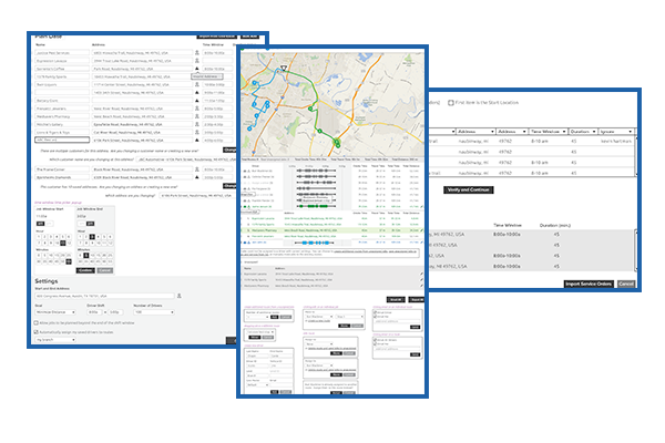
I work initially with pen & paper or a combination of in-browser modifications and Adobe Illustrator wireframes and mockups. My first step is usually to use one or the other to lay out the framework of all the functional requirements given to me by the PM after we've sat down to discuss each of the needs and use cases.
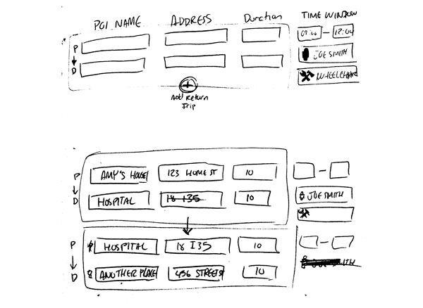
The first phase of the routing app was to produce the MVP (Minimum Viable Product), which meant establishing what the essentials were. I had to keep in mind any technical and especially time limitations while balancing all of that with delivering an excellent user experience.
Rough wireframes detailing all of the basic functionality were created, merged together in an Adobe Acrobat PDF or in a prototyping app like Invision so that page-linking could easily be added for an interactive walkthrough. I showed the basic wireframe to our PM and we talked about what was feasible, any changes that needed to be made, and how to further break down the features into separate phases as more development time was devoted to the app in the future after the MVP was released.
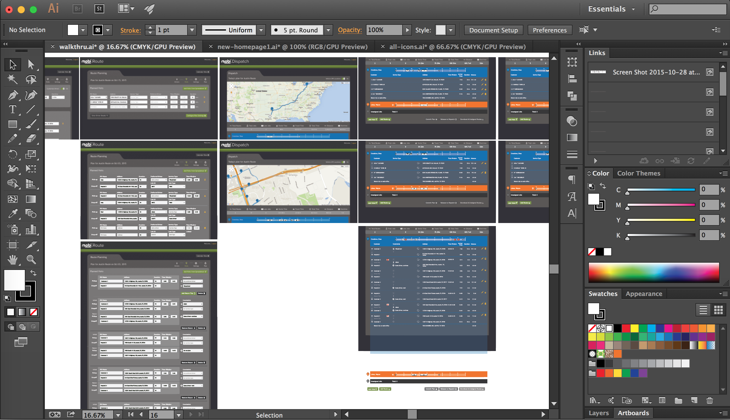 New mockups of additional features to the existing Route application
I went through several iterations and meetings with the executive team, PM, and lead developers where we hashed out new wireframes and then mockups, developed with the existing branding and UI artifacts used in our other apps. Design iterations occurred frequently and both in formal and informal meetings and chats. During these meetings I often have the wireframes, notes, or mockups in Illustrator and we make changes and adjustments on the fly to keep the discussion going without having to end the meeting and reconvene later.
Design Implementation
The case for designers who code
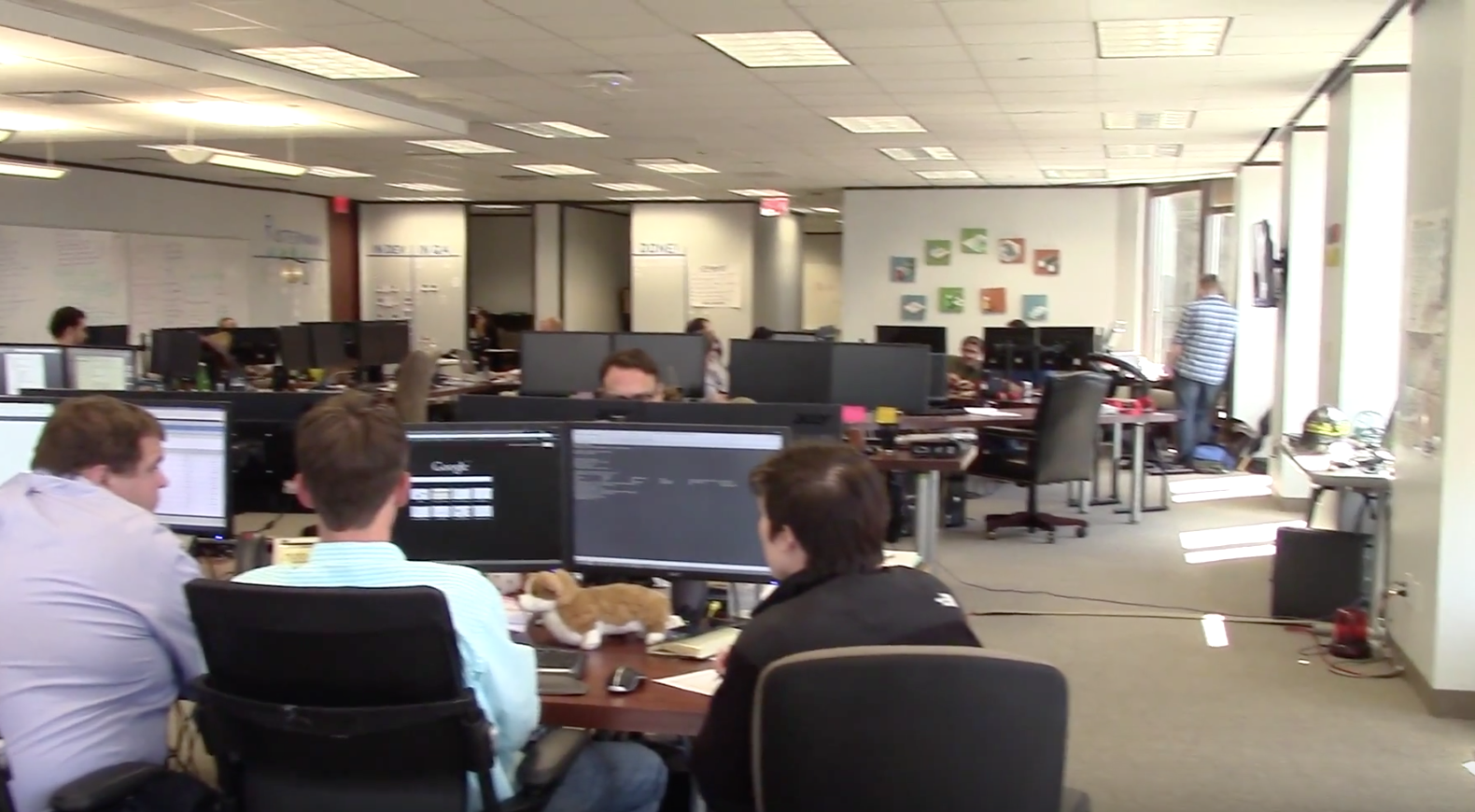
On a daily basis, devs form pairs to tackle one card per set and trade places the next day while one person anchors a card to share knowledge. When it came time to implement the new UI and interactions, I would pair with developers and lead with implementation of the HTML (a taste of foundation grids and modals with a whole lot of scratch-made patterns), CSS (Sass), and any Javascript necessary. Working this closely with the developers helped me implement the designs in ways that were stable and foundational, making future changes and additions to the UI easy for me or other designers, and were modular and easily hooked up to the back end, making the developer's lives easier too.
Working with the development team on more technical issues also helped me better understand any interactive and design limitations, so I became a more responsible and adaptable UX designer.
But wait, there's more!
Always evolving
Like most things in the digital world these days, the product keeps evolving. New companies with business requirements that our app doesn't yet support pop up. The executives want the app to cover a broader spectrum of companies with larger fleets and more complicated daily processes. New features must be added and some of the complexities of the grandfather route app, ESO, must be translated into the new clean UI.
The updated challenge is to satisfy these specific customers along with the internal business demands, while retaining the initial spirit and successes of the app. This often means holding back from merely adding more more more, which had lead to the downfall of ESO. Compromises must be negotiated on both sides (simplicity vs. abundance).
