A New mobiCorp.com
(Try it out!)
Who
mobi is a Software as a Service (SaaS) developer for service and delivery businesses that operate fleets of vehicles. mobi provides a suite of applications ranging from GPS tracking, route optimization, to analytics to help manage and improve operations for these industries.
What
The existing website has a lot of valuable information on it, a separate page for every product and all of the solutions, many benefits, a blog, a knowledge center, and much more content.
Why
There are too many choices and information overload. Much of the information remains outdated and the organic traffic to the site is followed by a high bounce rate and little retention. mobi also developed more refined sales and marketing strategies in other areas of the company and so it makes sense to reflect this in their website.
Identifying the problem
Identifying that there is a problem
We long knew there were issues with the current website– one of the biggest obstacles we have yet to overcome is clearly conveying the who and the what (and the why) of mobi. The site receives little traffic, which stems from other issues such as poor SEO, indexing, lack of marketing campaigns, external driving forces from salespeople in the field, etc.
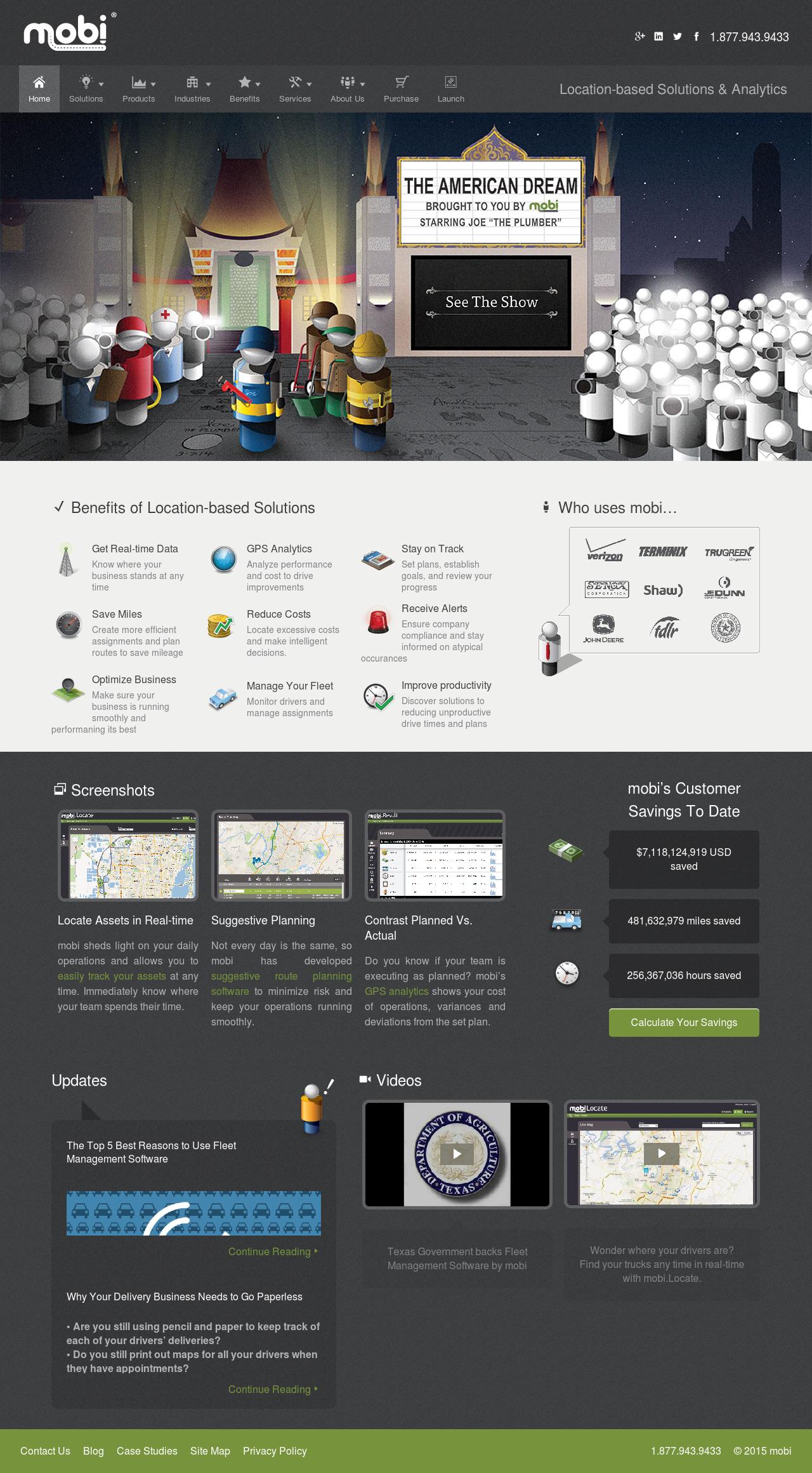
The old mobicorp.com
However, using google analytics we also understood that there was a very high bounce rate and the few who did interact with the website for any other reason than to go straight to the about/careers/management pages were not following any channels that we want them to (fill out a form for a free demo or a quote/OSA).
There were loosely defined goals we knew we wanted fulfilled but had neglected to outline a direct path towards how that is to be achieved from an organic experience (no salesperson leading the way for the user).
Presenting the case for change
Taking stock of the quantitative and qualitative data
In order to quickly gather anonymous feedback from those who were unfamiliar with mobi, I used Usability Hub's 5 second test to interview users for their first impression with the old website. Shortly after I created the first draft of the new landing page I repeated the test to see how the audience responded to the updated information. This data helped serve as a simple but powerful guide in reaffirming the correct direction to take the redesign, as well as key evidence to suggest a need for change.
We also conducted 3 video recordings using Peek to get deeper insight into how new users interacted with the brand and the website.
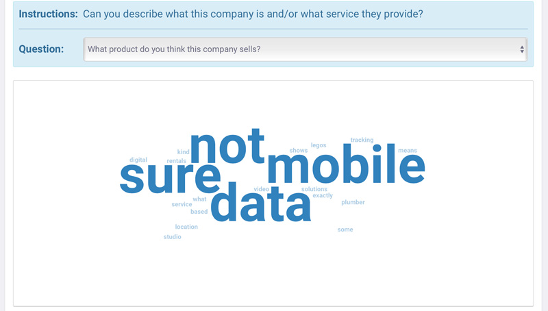
Real answers by real people regarding what service/product they thought mobi sells after spending 5 seconds on its homepage
What the existing home page does not do well:
- The hero image has no representation of what mobi does
- The video release (see the show) is 2 years old and has unclear interactive intentions with unknown consequences
- No supportive text or headlines that tells us exactly what mobi is or provides without confusing jargon
- Too many options in the navigation and within the content, leading to overchoice or choice paralysis.
- No clear call to action or obvious next steps.
- Content breadth is extremely large and takes some scanning (and patience) to get the gist of mobi
- User feedback studies resulted in many responses indicating that they thought mobi dealt with data, streaming, video, or other unrelated services
What it does do well:
- Uses recognizable customer logos to help establish credibility and trust (mentioned during a video interview with a user)
- One person who was video interviewed skimmed the benefits in search of what mobi is all about and honed in on the particular benefit “Manage your fleet. Monitor drivers and manage assignments” concluding that the company deals with fleets of vehicles
- Another interviewee saw the screenshots and understood that mobi deals with maps (but thought mobi was just a mapping/routing company)
- Yet another interviewee scrolled all the way to the bottom and clicked on one of the videos that had nothing to do with mobi, but was evidence that they were more likely to play a video easily accessible from the webiste (as opposed to the hidden American Dream videos).
The top fold: Making the seconds count
No room for fluff
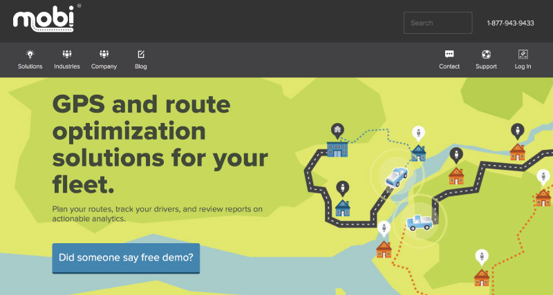
The proposed new design
The number one task that needed to be addressed was the first thing a new visitor sees– the hero image, the headline, the most important call to action (CTA), and clean navigation.
The hero image
Captures the visual nature of mobi's services. Serves as an eye-catching device to draw attention and keep it. An asymmetric weight of the image helps frame the next key information appropriately.
The key information (headline and subheadline)
Explains exactly what mobi is. No fluff.
The clean navigation
Previously, there were 9 options in the navigation. With dropdowns, there were 46 options. Now there are are 4 main options for new users, an additional navigation menu that is separate and clearly related to existing users' needs.
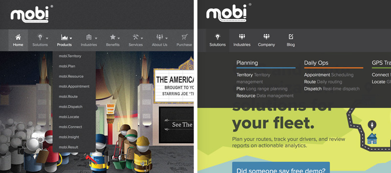
Less main navigation options with more defined sub-link descriptions helps users make a more informed and quicker decision
The CTA
So the user sees some cool videos or reads a quick blurb about the company– now what? Now there's a direct link to the request a demo form at the bottom of the page.
Getting into the specifics
Repurposing what works, tossing what doesn't
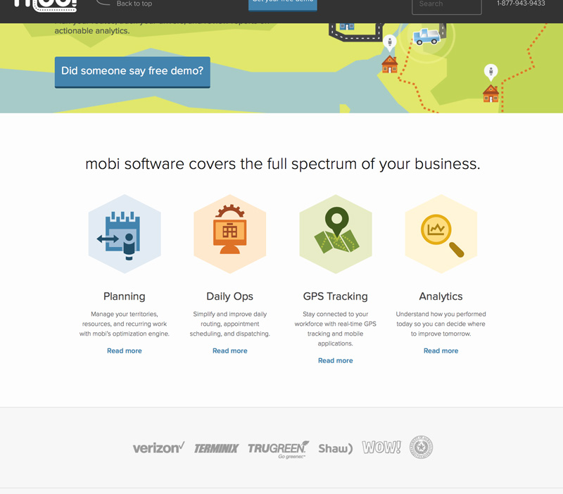
The content immediately below the top fold
As mentioned before, the marketing material of mobi has evolved over time and work had been done in all other formats except on the main website. Plenty of impromptu discussions and formal meetings took place to discover the best ways to present mobi's products and the plethora of information behind them.
It made sense to reuse a lot of the existing ideas sensibly, gathering the best concepts that helped define what mobi does, who the solutions are for, and how they can benefit their users in ways that sets mobi apart from the competition.
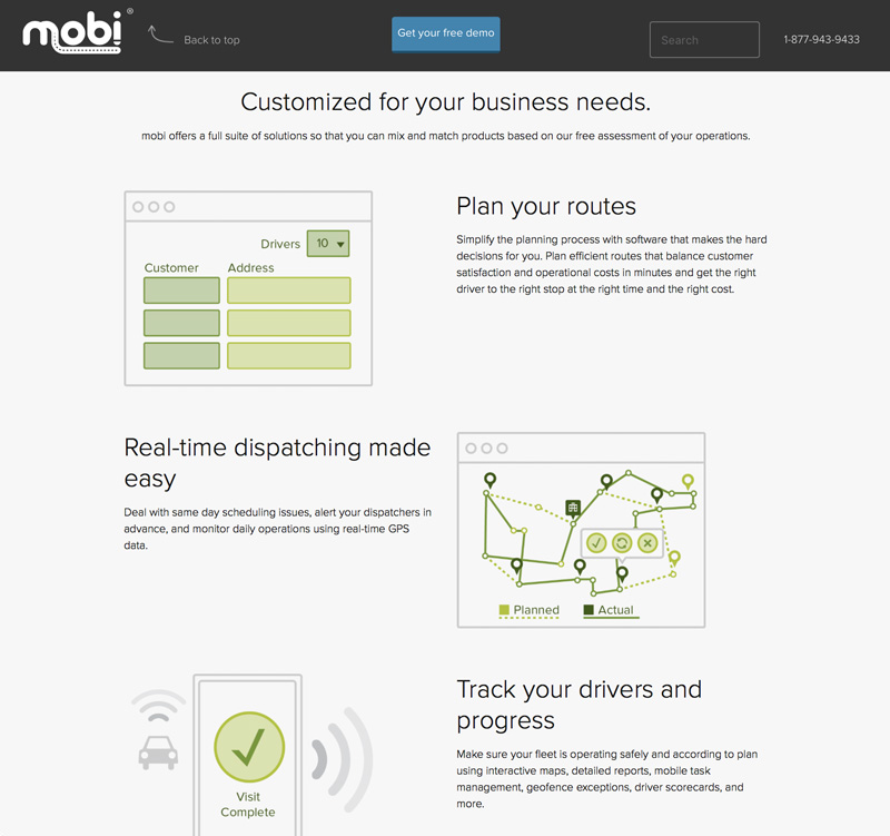
A detailed feature section highlights the 4 key business solutions that make mobi great
Joe the Plumber
Movie? What movie?
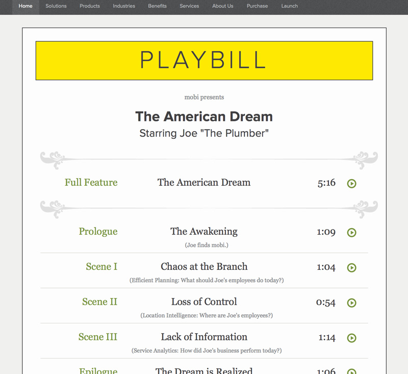
The playbill on the old homepage: Links to multiple chapters of the video, including the "Full Feature" that uses all of the chapters
The videos starring Joe "The Plumber" originally featured on the homepage's hero image do a great job of describing how mobi works out in the field and how it helped Joe's plumbing company excel in many areas. Unfortunately, the link was not obvious, and things got even more confusing once the user did decide to click on the link.
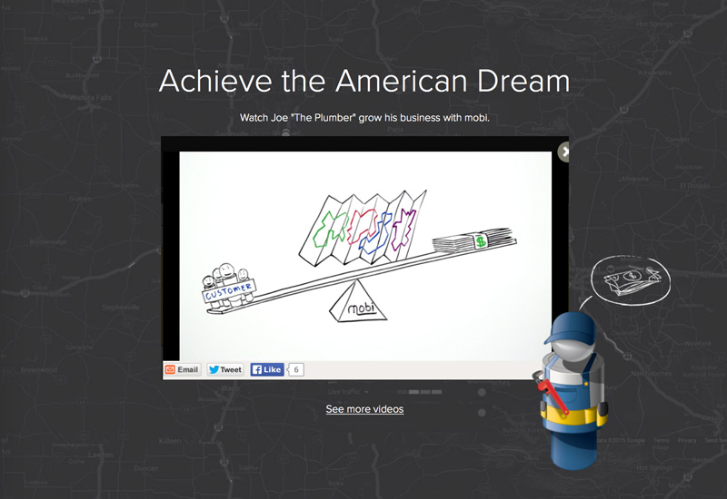
With the redesign the video is no longer head and center at the top of the page. However, it is prominently displayed in its own section further down the page for those who have already committed to spending time on the page and are looking to know more about mobi. Now, rather than making the choice to go to a new, unknown location and then having to pick from an arbitrary list of videos, the user makes the simple decision of whether or not to hit play.
A detailed feature section highlights the 4 key business solutions that make mobi great
